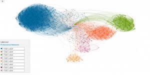
A visual map of Joe Hertvik’s LinkedIn connections. When shared from LinkedIn, this map will look different depending on how you’re connected to Joe’s network (click to enlarge)
Take a guess at what this is and how it relates to my LinkedIn profile (hint: you can get one, too).
Answer after the jump.
This is a map of my LinkedIn connections, or an InMap. I generated it from the LinkedIn labs Website and it clusters my different connections, according to similarities much like a coverage map. In my case, it created the following clusters:
- One cluster each for connections associated with my three prior jobs (orange, green, and brown points)
- One cluster for my connections associated with Hertvik Business Services, my IBM i SME status, and my articles and posts (blue)
- One cluster for links associated with family and friends (purple)
On this map, I can zoom in and see who is the most influential (connected) in each sub-group. As I zoom closer, names appear and it becomes more apparent who the biggest influencers are in each section (their data points are bigger). If I click on an individual connection data point, a mini-LinkedIn profile appears and I can even go to that user’s full profile. I can also add labels to each cluster area.
The other cool thing is that if I want, I can share this map with my LinkedIn connections, but it’s unclear what each person viewing the map will see: since they aren’t connected to all of my connections, they may not be able to interpret the cluster map the way I can.
I’m still looking at the map trying to determine just what type of value it has for LinkedIn users but for now I find it valuable for at least telling me where my areas of influence are and who is most strongly associated with each area. If nothing else, it gives me an idea of who my primary influencers are.
So check it out for yourself if you’re interested. LinkedIn also has a nice FAQ on the map and how it’s made that you can reach by clicking here.


